In the future, stores won’t have shelves
question: what does commerce look like in 5 years? 10? 50?
Take a look at some of these images:
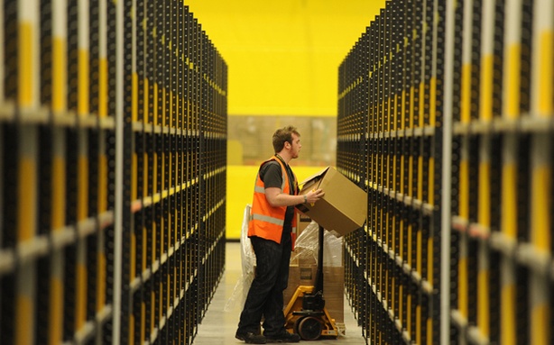
Amazon. The most world's efficient machine for moving anything that can be experienced on a screen and put in a box.
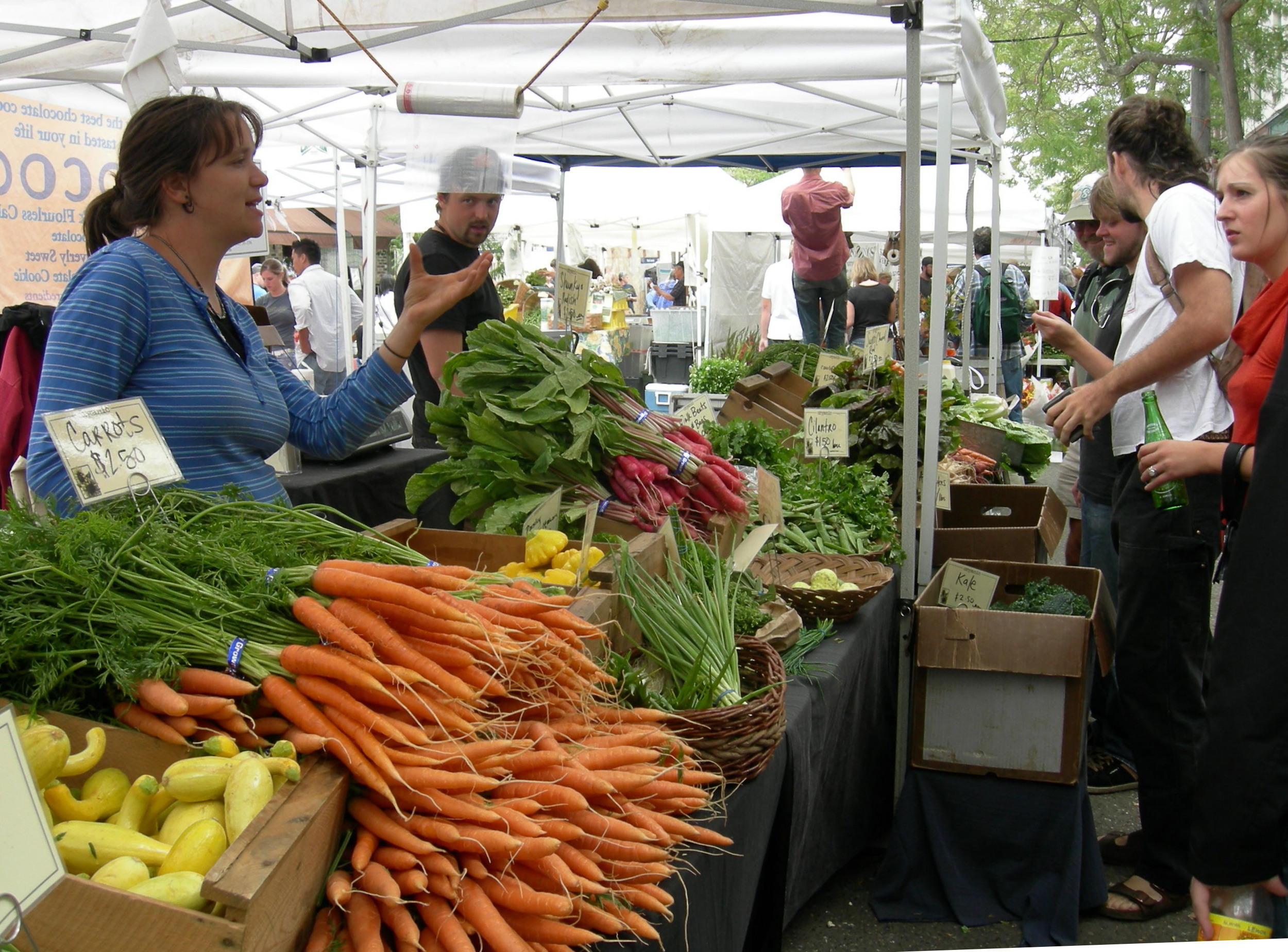
A farmer's market. The freshest food you can find nearby.
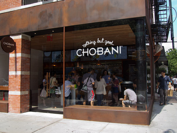
Chobani SoHo: an ad you can enter, touch, and taste
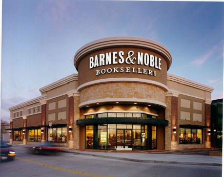
a box of books
In the future, stores won’t have shelves.
Screens have been quite good at displacing many kinds of brick-and-mortar retail. Record shops and bookstores were the first victims. Physical print is seemingly dead, or at least being pushed to survive on tactile value (quality paper, great photos; magazines you buy because they look good on your coffee table) and not on the informational content alone. It's also pointed out a lot that in other categories, quite a few people find stuff through their iPads and this trend is gaining momentum. But it can’t go on forever; at some point we will reach an equilibrium that's grounded in fundamentals. So while Amazon. for example, is a fascinating business (one whose main ingredients are CPU power, bandwidth, hard disks, robots, boxes, and trucks), it can’t expand its reach indefinitely. It has literally become a machine for moving goods to where they need to be ... but only when they are specifically demanded.
So in 50 years, where will the line be drawn between e-commerce and offline commerce? How will the two feed into each other? Will there even be a line? Why will we buy the things we buy?
What goods are going to be mainly sold online?

a data center
Any item with purely informational value (pure text, images, recorded music) is already there. The ones soon to follow are those with very little tactile value: commodity electronics (routers, cables, batteries, etc ... sorry, Best Buy / Radio Shack), drugs, tools, household supplies, generally disposable stuff that fills some simple need in your life but doesn't enrich it; these items don’t need to be experienced to be useful.
Of the goods sold online, which are going to be sold by Amazon-like companies?
Amazon can't sell everything in its cluttered, crappy product pages. You don't even go to Amazon unless you already know what you're looking for. On Amazon, you're going to buy a case of shampoo you need but not the next shirt or vintage summer dress or handmade earrings. Such products are going to be sold directly by vertically-integrated companies with distinctive brands, unique stories, and compelling content. They are where you discover things you didn't even know you wanted.
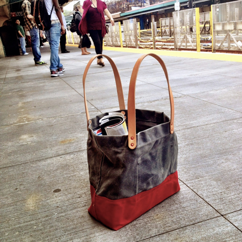
Handmade Tote
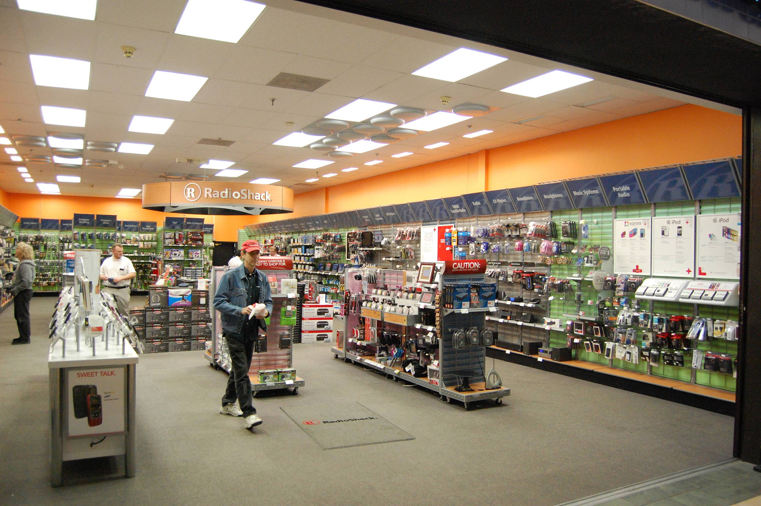
a worthless Radio Shack
When you experience goods in person, what will the store look like?
Will there even be shelves of stuff laying around in plain sight, wasting precious retail space? Try this thought experiment: if Amazon's logistics machine were INFINITELY efficient and fast at distributing goods, everyone else would use it as a platform, pushing the value of those shelves and inventory rapidly towards zero. Stores are forced to become less about stuff and much more about pitching product to you and making you desire it. Ultimately, they become more like showrooms.
In 20 years, will it be more of an immersive experience, involving a lot of interaction with the brand itself? Just imagine if you had a company selling camping gear and apparel. Maybe you'd walk into a store and see not racks and shelves but instead a tent, a fire pit, and even a wood-chopping station and it would all be arranged in a way that you wouldn't even know you were in a shop. Everything would be in a natural context. In this space, an aspirational lifestyle would already be set up before you; all you need to do is fill in the blanks by literally walking into the scene. You'll enjoy this little scene so much that you'll start to desire the items that were an integral part of it.
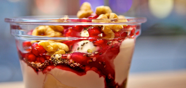
This is what Chobani has already done with their SoHo shop.
You walk in and there's a menu of seven different ways you can enjoy a cup of Chobani: with pomegranate and chia seeds and honey, or with blueberries and walnuts. After you place your order you're invited to observe through a window as someone prepares it, and you receive a colorful little recipe card to take home. At the end of the experience, after you've enjoyed the yogurt, (or as they colorfully called it, "a Yogurt Creation") you find that you can even keep a complementary branded glass cup. It sits in your cupboard, reminding you daily.
But ... it's on West Broadway in a fashionable area but they're selling $5 cups of yogurt, so they can't possibly be trying to be a real business. How can this be?
The entire yogurt shop is actually just an advertisement you can taste.
It's almost certainly budgeted as a marketing expense. It can be thought of as an interactive ad that helps educate a visitor of all the awesome ways you can have Chobani. You walk away thinking, "Gee, if I had a tub of Chobani and a basket of ingredients, I could have a great variety of delicious, healthy options for breakfast every day." And boom: they've sold you several months of yogurt, just like that.
How will we discover new things?
Seeing lots of awesome new things happens much more rapidly (and conveniently) online than offline. Using Flipboard, you flip through a hundred items in a few minutes. Doing the same thing by window-shopping would take you all day. But that discovery might drive an offline transaction if it's the kind of item you just need to try in person.
There will be a seamless transition from the moment you discover an item on your iPad to the moment you purchase that item in the store.
You're going to see eCommerce and offline commerce not only blur into each other but form a continuous experience. If the two work in concert, eventually we’ll have a much smoother shopping experience emerge:One day you’re reading a design/style blog and see a fantastic new blazer.You visit that brand’s website, flip through a lookbook, and see that it’s in stock in a shop on your way to work. You file your credit card and have them reserve it. With a tap, you also have them set aside a shirt you liked. The next day, you stop by. It’s a rich scene with dressed mannequins and props that reinforce the brand image. A display illustrates the manufacturing process for their denim; maybe there’s even a real loom. You tell the attendant your name, and he brings you the items that were set aside. You try them on and really like how they look and feel. With a tap to your phone and a nod to the shopkeeper, your card is charged and you go home with the items. A receipt is emailed to you. A note is made in the database and the next time you see their website, perhaps ties that pair well with that blazer are suggested to you, thus closing the loop.
Anyways, in conclusion ...
eCommerce isn't just about taking orders. It's really about telling a compelling story about a product using images, prose, video, and music. Stores, too, aren’t about cash registers and shelves; they’re going to do the same thing, but through your senses and things you can touch.